


Maps
Friday Eye Candy: USGS Launches Historical Topographic Map Explorer
A new tool, released in partnership with the U.S. Geological Survey and Esri, provides easy access to historical maps from all over the country, featuring a timeline to easily select maps from different eras.
Friday Funny: Mapping Seinfeld's Locations
Whether it was a show about nothing, or, as Eric Jaffe claims, a show about anything, Seinfeld was all about New York City. And it debuted 25 years ago, on July 5, 1989.
New Maps Compare Travel Times by Mode
Want to know the fastest way to get where you're going? You Are Here has created a new visualization tool that shows you the fastest mode for your trip in 11 cities.

40 Visualizations of America and its Relationship with Food
A new post by Vox includes 40 maps, charts, and graphs explain that where and how food works in America.
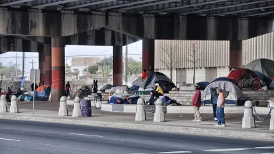
Mapping America's Homeless Populations
The Committee to End Homelessness in King County produced a helpful visualization tool that compares the size of homeless populations around the country as well as the type of housing support they receive.
Friday Eye Candy: 'You Are Here' Maps the Little Things
The Social Computing Group and the MIT Media Lab have launched the "You Are Here" project, mapping data points from cities where participants have lived. The project has colorful maps of bicycle crashes, coffee shops, and permanent visa applications.
New 'Job Access Map' at Work in New Haven, Connecticut
The Regional Plan Association recently released a Job Access Map—an interactive tool that allows user to discover the travel time homes and jobs, and much more, via every form of transportation.
NOAA Launching Storm Surge Mapping System
Americans tend to pay more attention to wind strength than storm surge when evaluating whether or not to evacuate before a hurricane. A new NOAA mapping project is designed to change perceptions about the multiple risks of storm events.
Mapping Where People Don't Live
A map released this week and shared on numerous websites shades the 4,871,270 U.S. Census Blocks with zero population. That includes rugged backcountry and suburban super malls.
Examining the Surprising Segregation of New York City
The common perception of New York City is as of a well-integrated city, full of multi-ethnic neighborhoods. But a recent article peeks behind the curtain of the city’s surprising boundaries of racial segregation.

Where’s the Nearest Airport? New Diagram Shows—for Every Place on Earth
"Each region is closer to a particular airport than any other," explains the creator of what's called a spherical Voronoi diagram. The diagram illustrates just how far that airport is.
What Does Citi Bike Data Reveal About New York City?
A website called I Quant NY has produced a string of posts examining recent ridership data released by Citi Bike. The visualizations and maps produced by the site make a good case for the value of open data.
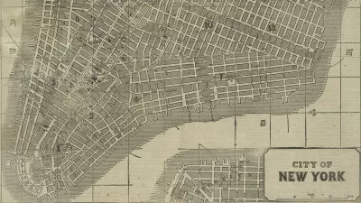
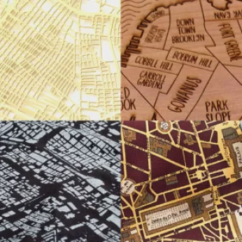
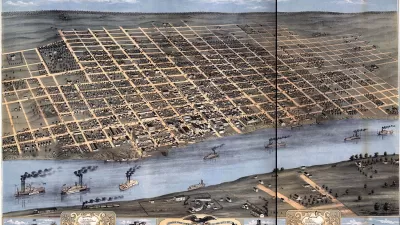
Friday Eye Candy: New York Public Library Releases Thousands of Historic Maps to the Public
“For the historic cartographile, Christmas may have come late, but here it is,” writes Daniel Stuckey.
Mapping NYC’s Taxi Redundancies
MIT’s Senseable City Lab produced a beautiful visualization of every taxi ride taken in New York City in 2011. More valuable than the pretty pictures, however, are the insights the data provide about creating a more efficient transportation system.
Can OpenStreetMap Overthrow the Google Maps Hegemony?
A recent long-read describes the current state of the competition for primacy in the world of online mapping tools. The champ—Google Maps. The challenger—OpenStreetMap.
Mapping the Rental Housing Crisis—County by County
A new map tool breaks down the availability of rental housing around the United States by county. While some markets are tighter than others, it’s impossible to find a place in the United States that has enough rental units per low-income households.
Mapped Snow Routes Reveal the Logic of Transportation Infrastructure
A side-by side-comparison of several cities’ snow routes reveals the inherent logic (or lack thereof) of their transportation infrastructure.
Friday Funny: A Map for Finding Lost Mittens
It’s Valentine’s Day, and it’s been a long winter in most parts of the country, so in the interest of staying warm and rightful pairs sticking together, here’s a website that lets people map the locations of lost mittens around New York City.
Friday Eye Candy: Mapping Urban Exercise Patterns
An enterprising blogger has produced a slew of urban maps with an overlay of publicly available data on exercise routes. In addition to being fetching, the patterns revealed show how runners make use of the public realm.
Behold the First-Ever Regional Transit Map of New York
For anyone not a fan of the Seattle Seahawks, the best result of this year's Super Bowl might have been the first-ever regional transit map of New York.
Urban Design for Planners 1: Software Tools
This six-course series explores essential urban design concepts using open source software and equips planners with the tools they need to participate fully in the urban design process.
Planning for Universal Design
Learn the tools for implementing Universal Design in planning regulations.
Heyer Gruel & Associates PA
Ada County Highway District
Institute for Housing and Urban Development Studies (IHS)
City of Grandview
Harvard GSD Executive Education
Toledo-Lucas County Plan Commissions
Salt Lake City
NYU Wagner Graduate School of Public Service


