


Interactive Maps

New York City Debuts Regional Mapping Tool
The Metro Region Explorer allows the public new kinds of understanding about the city of New York and how it fits into the surrounding region.

New Citywide Mapping Tool Marks a New Era for Planning in Boston
The Boston Planning & Development Agency released a powerful new map of the entire city—complete with layers like shadows, flood plains, and zoning districts—to the public.
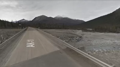
Exploring the Least Traveled Road in Every State
Who's ready for a road trip?
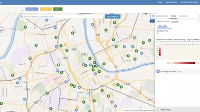
Presenting Municipal Data in an Interactive Map, Nashville Style
The city of Nashville launched the NashView interactive data map earlier this month.

Mapping the LGBTQ-Friendliness of the World's Cities
A colorful data visualization tool maps information about which cities have the most protections for LGBTQ people in place. The tool is intended as a resource for LGBTQ travelers.

A New Way to Explore Local Transit Ridership Data
TransitCenter has released a new National Ridership Map.
Mapping the Country's Debt
An interactive map from the Urban Institute invites comparisons in the geography of debt.

'Housing Insights' Mapping Tool Designed to Preserve Subsidized Housing in D.C.
The Housing Insights team of volunteer civic hackers hopes you'll use their software in other cities, too.

Interactive Map Locates Queer History of St. Louis
The ongoing project aims to show how LGBT history is embedded throughout the city.
Meet the New 'Neighborhood Stereotyping Tool'
'Hoodmaps' are here, but the crowdsourcing map tool is attempting to improve on the "Judgmental Maps" that came before.

Watch Transit Move With These Animated Maps
The variables in public transit service have never been so brightly and kinetically illustrated.

Friday Eye Candy: Mapping the Nation's Internet Trolls
Finally, we know where Internet trolls come from—no, not the basements of parents' houses.

Metrorail Travel Patterns Revealed
Commute data for one of the nation's premier rail transit systems, revealed.
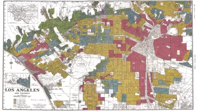
New Mapping Tool Illuminates the Consequences of Redlining
According to Next City, a new mapping tool from the National Community Reinvestment Coalition reveals the roots of gentrification in addition to making stark a history of discrimination.

Pittsburgh Takes Property Data Visualization to the Next Level
Not all property data maps are created equal.

An Interactive Map of the World's Climate in 2100
A new map presents two scenarios: the temperature in 2100 if recent emissions trends continue unabated, and the temperature in 2100 with moderate emissions cuts.
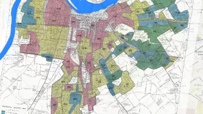
Mapping the Tools of Discrimination
The Innovations in Government Program at the Harvard Kennedy School’s Ash Center for Democratic Governance and Innovation has announced the first winner of the "Map of the Month" contest.

Mapping Chicago's Zoning Code Changes
A new interactive map feature launched by the Chicago Cityscape website maps all the zoning changes up for approval around the city.
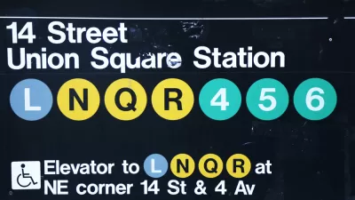
A Tool to Show the Effects of Transit Closures
The NYC Transit Explorer from Sidewalk Labs shows how much transit service New Yorkers stand to lose when the L Train shuts down for 18 months.

Mapping the Country's Bridge Maintenance Crisis
A new, interactive feature by The Washington Post endeavors to bring the point about the nation's crumbling infrastructure closer to home.
Urban Design for Planners 1: Software Tools
This six-course series explores essential urban design concepts using open source software and equips planners with the tools they need to participate fully in the urban design process.
Planning for Universal Design
Learn the tools for implementing Universal Design in planning regulations.
Clanton & Associates, Inc.
Jessamine County Fiscal Court
Institute for Housing and Urban Development Studies (IHS)
City of Grandview
Harvard GSD Executive Education
Toledo-Lucas County Plan Commissions
Salt Lake City
NYU Wagner Graduate School of Public Service


