


data visualization

An App for California State Parks
California's Department of Parks and Recreation is getting into the app business. It is hoped that CaliParks will help improve access to the state's parks for young people and minorities.
Friday Eye Candy: SPUR's Urban Cartography Exhibit
Allison Arieff provides a glimpse to the San Francisco Planning and Urban Research's new exhibit featuring interesting maps of the San Francisco Bay Area.
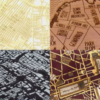
Friday Eye Candy: 'Crayon the Grids' City Mapping
Artist-scientist Stephen Von Worley is taking on a new project— mapping the world's city streets based on a complex set of algorithms and psychedelic colors.

Mapping the New Deal
The Living New Deal Project Map from the University of California, Berkeley was released earlier this month, pinpointing all of the New Deal projects around the United States.
'I Quant NY' Brings Data Journalism to the People
Ben Wellington teaches a statistics course based on NYC Open Data at the Pratt Institute’s City & Regional Planning program, and is the founder of the quirky data blog "I Quant NY."
Mapping the Skill Sets Unique to Cities
The skills and location data of over 175 million LinkedIn members were mined to produce a map displaying the industries most common in major cities throughout the United States and Europe.
Domestic Migration, Visualized
The New York Times recently visualized domestic migration and population makeup for each state in the United States from 1900 until today using Census data.
The Role Infrastructure Employment Plays Throughout The United States
Brookings illuminates which states rely heaviest on infrastructure for employment as local policymakers are struggling with reliable federal funding throughout the peak of construction season.
StreetSeen: A New Tool for Understanding the Built Environment
Want an easy to use public engagement tool that helps you to understand the visual preferences of the public? StreetSeen (http://streetseen.osu.edu), a free online tool allows planners and others to simply construct and deploy visual surveys.
The Best Maps of 2013
GIS Lounge is back with its list of the "most interesting and best" maps of the year. This year's honorees make traffic flows come to life, track global bike share inventory, and visualize regional differences in American speech.
Six Magnificent Maps of 2012
The "best of 2012" lists are just starting to spread and, already, one of the most unique collections we've come across is Caitlin Dempsey's look at the year's most interesting maps. You don't have to be a cartographer to enjoy these visualizations.
Stunning Videos Of Public Transit Patterns
Data visualizations show the daily ebb and flow of public transit traffic in world's major cities.
Animating San Francisco's Turbulent Decade
A joint project by technology company Esri and the city of San Francisco shows the promising confluence of open data and innovative visualization techniques.
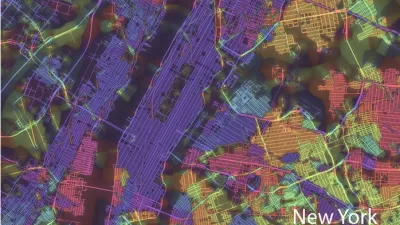
Data Becomes Art in the Hands of this Cartographer
Eric Jaffe profiles the work of "self-proclaimed 'map geek'" Eric Fischer, whose remarkable renderings of urban data seek to uncover a deeper beauty, and truth, in the deluge of information.
Urban Design for Planners 1: Software Tools
This six-course series explores essential urban design concepts using open source software and equips planners with the tools they need to participate fully in the urban design process.
Planning for Universal Design
Learn the tools for implementing Universal Design in planning regulations.
City of Albany
UCLA Lewis Center for Regional Policy Studies
Mpact (formerly Rail~Volution)
Chaddick Institute at DePaul University
City of Piedmont, CA
Great Falls Development Authority, Inc.
HUDs Office of Policy Development and Research


