


Is it possible to condense two weeks of soaring rhetoric by politicians into a single graphic? Let's find out. In my last post I covered free online tools for creating information graphics. Here is a look at another free online tool that can be used to easily create sophisticated visualizations and information graphics.

 Is it possible to condense
two weeks of soaring rhetoric by politicians
into a single graphic? Let's find out.
In my last post I covered free online tools for creating
information graphics. Here is a look at another
free online tool that can be used to easily create sophisticated
visualizations and information graphics.
Is it possible to condense two weeks of soaring rhetoric by politicians
into a single graphic? The New York Times did just that in an
efficient
visualization of the speeches made during the Democratic and Republican
conventions. Titled "The
Words They Used",
the graphic highlights and compares the themes that speakers both
parties chose to focus on. The technique used in the NYT
graphic is similar to visual technique popular on
websites today known as a "word cloud" or a
"tag cloud". A word cloud is a visual
representation of the frequency of words used in a body of text.
(Some examples: Tagclouds at the social bookmarking site Delicious
and on Planetizen Radar.)
Wouldn't it be useful if we could use this same technique to analyze
other texts that we often encounter such as articles, reports,
policies, plans,
and websites?
Let's start with
Planetizen's news coverage. Here is a word cloud of
Planetizen's news
stories for the first half of this year:

I created this graphic using a free online tool called Wordle
created by Jonathan Feinberg. Creating
word clouds couldn't
be simpler using Wordle. Copy and paste some text and then
click "go" to create
your own word clouds.
Here is a word cloud of Planetizen news for the same time period filed
under "environment" and "energy".

Now, let's use word clouds to look at John McCain's and
Barack Obama's policy statements on energy, climate change, and the
environment. Both candidates have published statements on
their
respective websites about their position on climate change, the
environment, and energy.
To create word clouds of these
statements, I used a similar web application developed by
IBM's research and development labs called "ManyEyes".
More about Many Eyes later in this post. First,
let's look at the word clouds.
(Click on the visualization graphic to see the interactive
version.)
1. John McCain on Energy
[ Source
| Visualization
]

2. John McCain on Climate
Change
[ Source
| Visualization
]

3. Barack Obama on Energy
& Environment
[ Source
| Visualization
]

And now, a comparative word cloud.
4. McCain on Energy
& Climate Change vs. Obama on Energy &
Environment
[Sources same as above | Visualization
]
The following visualization is called an "interleaved tag cloud".
McCain's words are in brown and Obama's words are in blue.

[Note: The John McCain website has two separate statements on energy
and
climate change. The Barack Obama website has one statement on
both
environment and energy. For the purposes of
this
demonstration, I combined the two McCain statements. Also, the source text on the two candidates websites may have changed since I created the visualizations.]
Barack Obama has also published an Urban Policy Plan. I could not find
McCain's plan on the topic. Here are some visualizations of Obama's
plan:
- Barack
Obama Urban Policy Web Page Tagcloud - Barack
Obama Urban Policy Plan Tagcloud - Barack
Obama Urban Policy Plan: Transportation Word Tree - Barack
Obama Urban Policy Plan: Housing Word Tree
ManyEyes
ManyEyes was
created by Martin
Wattenberg and Fernanda
B.Viégas of the Visual
Communication Lab at IBM's Watson Research Center.
Here is a video of Dr. Viegas explaining what you can do with
Many Eyes.
Visualization
tool: ManyEyes Interviewed by JD
Lasica on Vimeo.
To summarize, you can upload your own data to Many Eyes. The
data can be text as we did in the above examples. ManyEyes can handle the data you have sitting around in spreadsheets and databases too. You can upload
numerical data in a specific format.
You can
then create visualizations from your data. Many Eyes offers 16
different types of visualizations
at this time including maps, graphs, charts, histograms. treemaps,
scatter plots, network diagrams, word clouds, and word trees.
Browse through the over 2100
visualizations already created at ManyEyes. To learn how to create your own see Richard Heog's tutorial.
ManyEyes aims to bring visualization
tools within reach of more people by taking away the need for special
computer software or skills. It is indeed easy to upload data and
create visualizations that can
help analyze data and spotting trends or
patterns. (It is also
possible to create meaningless visualizations easily.)
This is where ManyEyes does something interesting. By uploading data to ManyEyes users agree to share their data. So you can create
visualizations from data uploaded by other users. Many Eyes also
features "topic hubs"
where users organize datasets and visualizations on a particular topic
and get together to share insights. This is similar to how
websites such as Flickr and
YouTube work --
by encouraging and make
it easy for anyone to upload, categorize, share, and comment
on their digital content. By letting "many eyes" look at and
work with your data and visualizations, there is the possibility
of others spotting something that you haven't.
We know this collaborative approach works for open source software, political blogs, and wikis. Will it work for data analysis and visualization?
[Also see Part 1 -- Infographics for the rest of us ]

Infographics For The Rest Of Us
An introduction to free tools for creating interactive information graphics. As professionals shaping the built and natural environment, we have to process and communicate complicated concepts and data to peers and the public. We often use visuals such as maps, charts, graphs, and diagrams to illustrate a concept or explore data. Such visual representations are called information graphics or infographics.
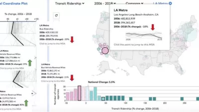
'Transit Insights' Updated With New Features for Visualizing Public Transit Data
One of the best tools for understanding the consequences and potential of transit planning has been recently updated.
Stunning Videos Of Public Transit Patterns
Data visualizations show the daily ebb and flow of public transit traffic in world's major cities.

Alabama: Trump Terminates Settlements for Black Communities Harmed By Raw Sewage
Trump deemed the landmark civil rights agreement “illegal DEI and environmental justice policy.”
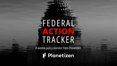
Planetizen Federal Action Tracker
A weekly monitor of how Trump’s orders and actions are impacting planners and planning in America.
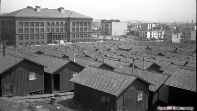
The 120 Year Old Tiny Home Villages That Sheltered San Francisco’s Earthquake Refugees
More than a century ago, San Francisco mobilized to house thousands of residents displaced by the 1906 earthquake. Could their strategy offer a model for the present?

In Both Crashes and Crime, Public Transportation is Far Safer than Driving
Contrary to popular assumptions, public transportation has far lower crash and crime rates than automobile travel. For safer communities, improve and encourage transit travel.

Report: Zoning Reforms Should Complement Nashville’s Ambitious Transit Plan
Without reform, restrictive zoning codes will limit the impact of the city’s planned transit expansion and could exclude some of the residents who depend on transit the most.

Judge Orders Release of Frozen IRA, IIJA Funding
The decision is a victory for environmental groups who charged that freezing funds for critical infrastructure and disaster response programs caused “real and irreparable harm” to communities.
Urban Design for Planners 1: Software Tools
This six-course series explores essential urban design concepts using open source software and equips planners with the tools they need to participate fully in the urban design process.
Planning for Universal Design
Learn the tools for implementing Universal Design in planning regulations.
Clanton & Associates, Inc.
Jessamine County Fiscal Court
Institute for Housing and Urban Development Studies (IHS)
City of Grandview
Harvard GSD Executive Education
Toledo-Lucas County Plan Commissions
Salt Lake City
NYU Wagner Graduate School of Public Service