An introduction to free tools for creating interactive information graphics. As professionals shaping the built and natural environment, we have to process and communicate complicated concepts and data to peers and the public. We often use visuals such as maps, charts, graphs, and diagrams to illustrate a concept or explore data. Such visual representations are called information graphics or infographics.
![]()
An introduction to free tools for creating interactive information graphics.
As professionals shaping the built and natural environment, we have to
process and communicate complicated concepts and data
to
peers and the public. We often use visuals such as maps,
charts, graphs, and diagrams to illustrate a concept or
explore data. Such visual representations are called information
graphics or infographics.
[Also see Part 2 -- YouTube For Your Data: Many Eyes on Obama & McCain]
Creating effective infographics is both an art and a science. A good
information graphic needs to be both beautiful and accurate.
Creating innovative infographics has typically been
the realm of experts --
those with the requisite design talents and expertise with
sophisticated software. Now a new
breed of web-based tools have emerged, making it easier for the rest of
us to quickly create interesting visuals. (This is similar to
how Google Maps and Google Earth have
brought elementary mapping
and geographic data exploration within the reach of anyone with access
to the internet.)
These web-based tools for generating infographics are limited and
specific in what they can do. Yes, you can use these tools to
create graphics that can be included in reports, presentations, and
websites. But they allow us to do something more significant. These
web-based tools bring interactivity to infographics.
They generate visuals in unconventional formats,
enabling us to expand our visual toolset beyond that of
the common bar charts and staid diagrams that we see
and use so often. And, as an added
benefit, some of these tools follow Web 2.0
principles, facilitating collaboration and encouraging information
sharing.
Here are some free tools that I find both interesting and
useful.
Timelines
A graphical timeline
is a visual representation of a chronology of
events. Web-based timelines offer some advantages that
timelines on paper cannot. The ability to interact with the timeline,
change the time scale, "zoom" & "scroll" the timeline, or link
to other information on the web can increase the communication power of
a
timeline. You don't have to be a skilled web
developer to build a interactive timeline. Dipity is a free
web-based tool that allows you to create timelines, add
events, pull in or link to information from other sources,
add images, and more. (You need to sign up for a free account.)
To test it out I started a timeline of the life of Frederick
Law Olmsted,
considered to be the father of American
landscape architecture. Referring to his biography on
Wikipedia,
I picked out a few events and started adding them to a new timeline on
Dipity.
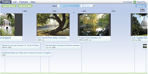
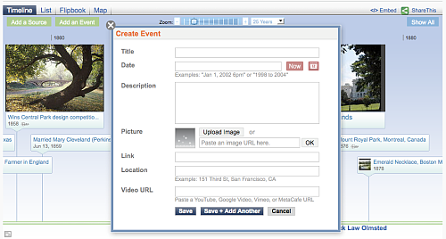
When you add an event to a timeline, in addition to the title, date,
and description of the event, it is possible to upload a picture, link
to a webpage, or add a location.
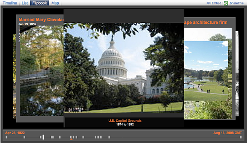
Dipity presents the uploaded images as a slideshow or a "flipbook".
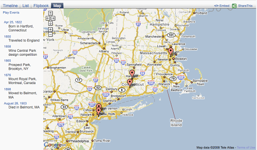
Location information is presented on a map.
Visit the
interactive timeline
I created. It's incomplete. I was planning to add in
most of
Olmsted's projects. But he had a prolific career and adding events to a
timeline takes
time. You don't have to build a timeline alone though. In
true
Web 2.0 tradition, Dipity makes it possible to collaborate with others
on a timeline. Invite editors or open it up so that anyone can edit it.
It is also possible to automatically generate a timeline based on a
data source. If you use Web 2.0 services such as Flickr, Picasa,
Blogger, Wordpress, YouTube, or Twitter, you can generate a
timeline based on your data at those websites. Or grab any
RSS
feed and generate a timeline from it. I created a live timeline
of 5+ magnitude earthquakes by specifying the source of the
timeline to be the appropriate
RSS feed
from USGS. Since the feed includes images and location
information, Dipity creates a flipbook showing the location of the
earthquakes and displays the location on an interactive Google map.
Create it once and Dipity will keep the timeline updated.
You can capture images from the timeline for use in other documents. Or
you can embed the timeline itself on your own website.
It is so easy to generate a timeline using a data source that I
couldn't resist the urge to create another one. Here is a
timeline of recent
blog posts on Planetizen Interchange. Does this
post appear there?
[Web developers might be interested in MIT's Simile Timeline project.
It is now part of Google's web widgets
collection.]
Sparklines
The line chart is a common format used to show
numeric data. A
line chart can be easily created using spreadsheet software.
Usually this is a large graphic. Information graphics
expert Edward Tufte --- The New York Times called him the "da
Vinci of Data" -- proposed an alternative for situations
where a
more compact, condensed visual format is more appropriate. He coined
the name sparkline
for the format and described it as an "intense, simple, word-sized,
graphic". Here is what a sparkline looks like:
By itself, it doesn't convey much. That is because a sparkline is meant to be
presented alongside numbers and/or text. For example, here is
a
table from the U.S. Energy Information Administration showing the energy
profile of the United States:
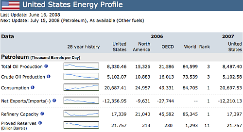
Note how much information is conveyed in a small space and how multiple
sparklines make it possible to compare different trends.
The Wikipedia page on sparklines links to resources for creating
sparklines including add-ons for spreadsheet software. The one I found
easiest to use is the free web-based parkline generator at BitWorking.
All you need is some numerical data to chart separated by commas.
For example here is some data:
Plugging this information
into the sparline generator results in:
![]() or
or
![]()
or ![]()
depending on the format you choose.
Include the code in your webpage or capture the image to include in
your documents. That's all there is to it. The difficult part
is deciding where and how to use there. If you use sparklines in your
own work and find them effective, send me some examples.
Mind Maps
According to Wikipedia:
A mind map is a diagram
used to represent words, ideas, tasks, or other items linked to and
arranged radially around a central key word or idea. It is used to
generate, visualize, structure, and classify ideas, and as an aid in
study, organization, problem solving, decision making, and writing.
map might be even more valuable. So a mind mapping tool needs to be
flexible and not come in the way of the diagramming process. I find
that pen and paper or a whiteboard are actually the best tools for mind
mapping. But we are talking about digital tools here. Besides, if you
want to include the finished mind map in your presentation or document
you need something looks more professional.
My favorite digital tool for mind mapping is Freemind,
an open source desktop application that runs on Linux, Mac OSX, or
Windows computers. Since it is a desktop application, it is not
necessary to be online to use it. So you can use it for brainstoring at
meetings or outlining some ideas on a flight. I will use it here to
create an example of a mind map.
The Open Directory Project
(ODP) is the web's largest human edited directory. It is
maintained by volunteers. It has a section on urban
planning with a heirarchy of topics and links. Using
Freemind, I created a mind map of the heirarchy used by ODP.
There are several other web-based tools you can used to
create mind maps and other diagrams. Try mind42.com, Mindomo, MindMeister,
and Gliffy.
If you come across examples of effective infographics used in
urban planning and related fields, let me know at chavan at planetizen dot com.

Alabama: Trump Terminates Settlements for Black Communities Harmed By Raw Sewage
Trump deemed the landmark civil rights agreement “illegal DEI and environmental justice policy.”

Planetizen Federal Action Tracker
A weekly monitor of how Trump’s orders and actions are impacting planners and planning in America.
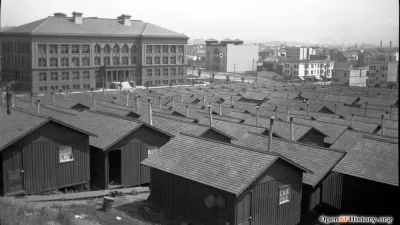
The 120 Year Old Tiny Home Villages That Sheltered San Francisco’s Earthquake Refugees
More than a century ago, San Francisco mobilized to house thousands of residents displaced by the 1906 earthquake. Could their strategy offer a model for the present?

In Both Crashes and Crime, Public Transportation is Far Safer than Driving
Contrary to popular assumptions, public transportation has far lower crash and crime rates than automobile travel. For safer communities, improve and encourage transit travel.

Report: Zoning Reforms Should Complement Nashville’s Ambitious Transit Plan
Without reform, restrictive zoning codes will limit the impact of the city’s planned transit expansion and could exclude some of the residents who depend on transit the most.

Judge Orders Release of Frozen IRA, IIJA Funding
The decision is a victory for environmental groups who charged that freezing funds for critical infrastructure and disaster response programs caused “real and irreparable harm” to communities.
Urban Design for Planners 1: Software Tools
This six-course series explores essential urban design concepts using open source software and equips planners with the tools they need to participate fully in the urban design process.
Planning for Universal Design
Learn the tools for implementing Universal Design in planning regulations.
Clanton & Associates, Inc.
Jessamine County Fiscal Court
Institute for Housing and Urban Development Studies (IHS)
City of Grandview
Harvard GSD Executive Education
Toledo-Lucas County Plan Commissions
Salt Lake City
NYU Wagner Graduate School of Public Service


