


When done right, data visualization effectively translates complex data into easily understood visuals in the form of graphs, charts, maps, plots, animations, and more.

Data visualization is the representation of data through the use of common graphics, such as charts, plots, infographics, animations, and others. These displays of information are used to communicate complex data relationships and data-driven insights in a way that is easy to understand. In this article, Charles Mahler discusses seven best practices for data visualization which include:
- Have a goal in mind.
- Choose the right visualization tool.
- Choose the right type of visualization.
- Use succinct labels and titles.
- Choose the right colors.
- Avoid clutter and unnecessary elements.
- Use data that is clean and up to date.
Mahler also offers some criteria for good data visualizations. Specifically, good data visualization should:
- Show complex data connections in a way that is easy to understand, clear, concise, and clutter-free.
- Enable your audience to quickly grasp the key points you are trying to communicate.
- Effectively communicate the information and ideas in the data using the right visual elements.
- Consider the needs of various audiences, while being accessible and inclusive by using clear and legible fonts and text sizes.
- Be simple and straightforward without unnecessary elements or distractions.
- Be based on accurate, current, and reliable data.
For details, please read the source article.
FULL STORY: 7 Best Practices for Data Visualization


How Cities Can Leverage Financial Data for Smarter Urban Planning
Explore how cities can use financial data to enhance urban planning, improve budget allocation, and boost community services.

The Growing Importance of Data Storytelling
Data storytelling refers to the ability to effectively communicate insights from data using narratives and visualizations. When done right, it can be used to put data insights into context and inspire action from decisionmakers.
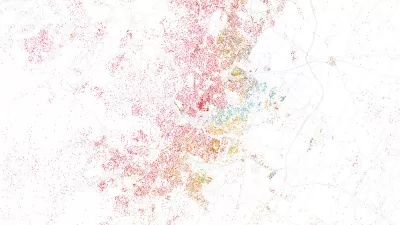
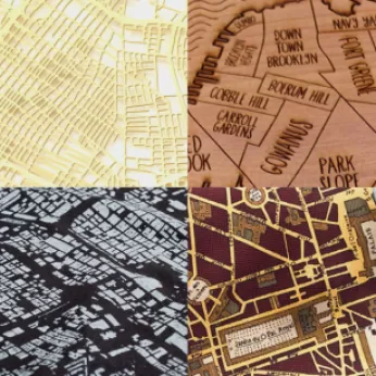
Esri App Makes Data Visualization Easy
A wealth of pre-authored policy maps lets users access data to explore public policy issues.

Alabama: Trump Terminates Settlements for Black Communities Harmed By Raw Sewage
Trump deemed the landmark civil rights agreement “illegal DEI and environmental justice policy.”

Study: Maui’s Plan to Convert Vacation Rentals to Long-Term Housing Could Cause Nearly $1 Billion Economic Loss
The plan would reduce visitor accommodation by 25% resulting in 1,900 jobs lost.

Planetizen Federal Action Tracker
A weekly monitor of how Trump’s orders and actions are impacting planners and planning in America.

Federal Homelessness Agency Places Entire Staff on Leave
The U.S. Interagency Council on Homelessness is the only federal agency dedicated to preventing and ending homelessness.

Restoring Northern India’s Himalayan ‘Water Temples’
Thousands of centuries-old buildings protect the region’s natural springs and serve as community wells and gathering places.

Milwaukee to Double Bike Share Stations
Bublr Bikes, one of the nation’s most successful, will add 500 new e-bikes to its system.
Urban Design for Planners 1: Software Tools
This six-course series explores essential urban design concepts using open source software and equips planners with the tools they need to participate fully in the urban design process.
Planning for Universal Design
Learn the tools for implementing Universal Design in planning regulations.
Caltrans
Smith Gee Studio
Institute for Housing and Urban Development Studies (IHS)
City of Grandview
Harvard GSD Executive Education
Toledo-Lucas County Plan Commissions
Salt Lake City
NYU Wagner Graduate School of Public Service